A new look – Introducing the new Corporate Design
June 2021
Bye-bye Rendering
The funding as "Reallabor Radbahn" marks a new chapter for Radbahn. We decided to take this opportunity to freshen up our visual appearance. Through a reQned design, we aim to create a new space characterized by a people-oriented narrative.
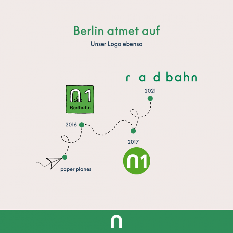
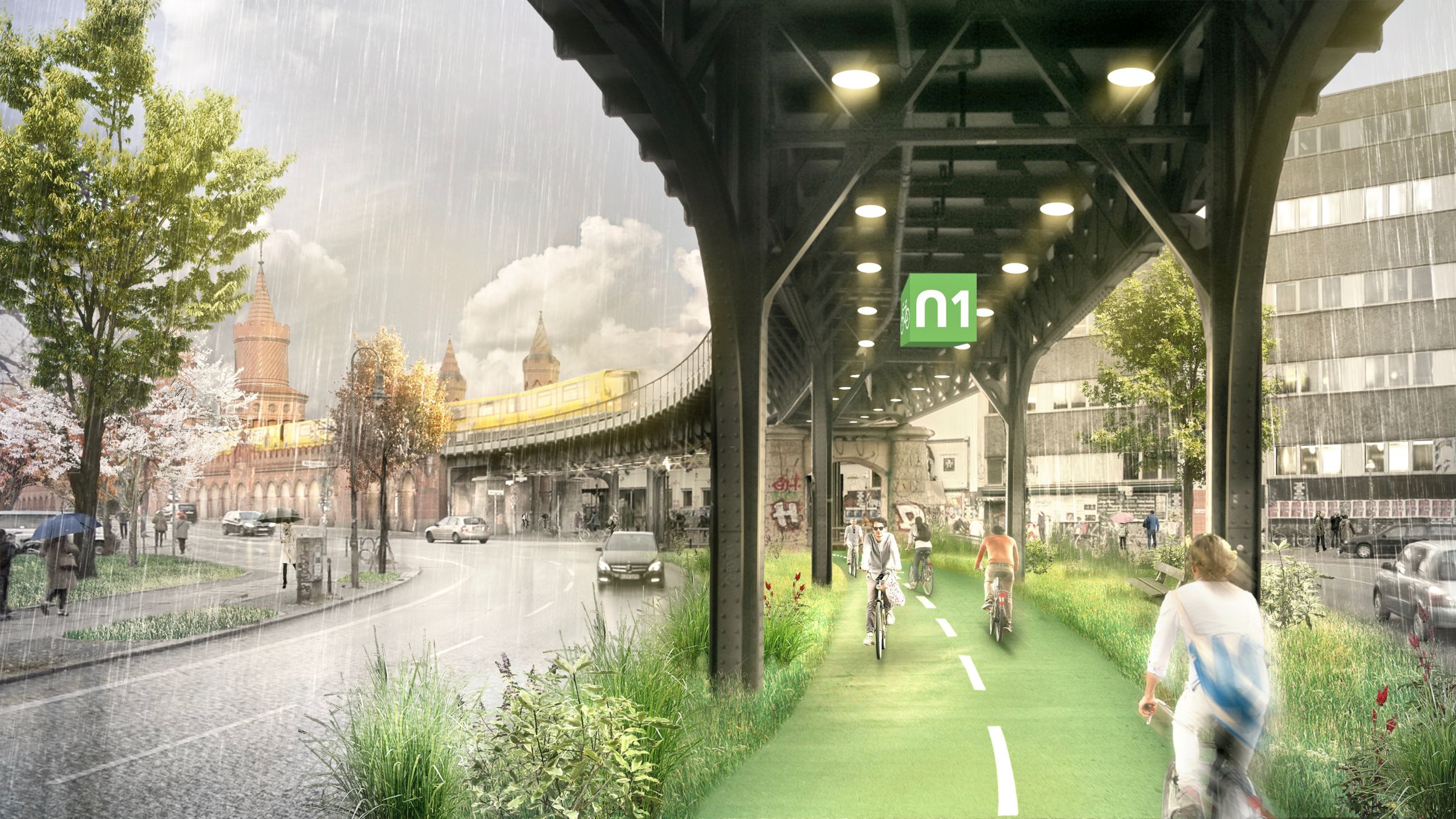
Ever since the publication of the book Radbahn Berlin.Future Visions for the Ecomobile City in 2017, we have presented Radbahn to the public through photo-realistic drawings, so-called "renderings". These images stuck and helped to inspire people and transmit a clear idea of what public space could like in the future.
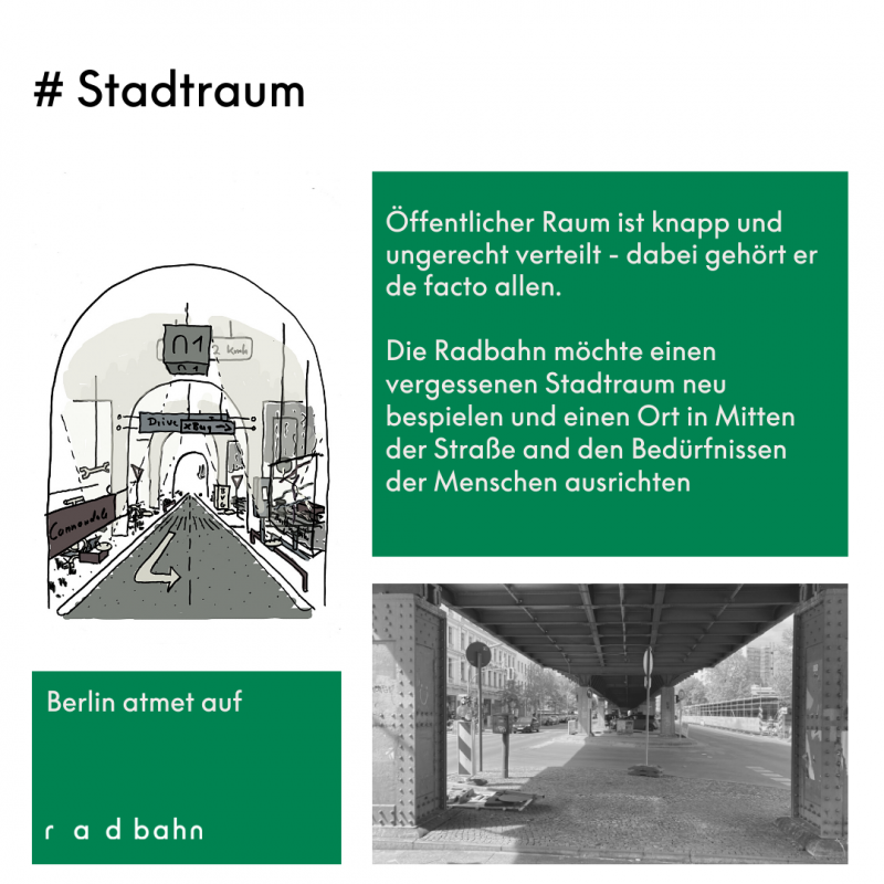
Today, however, our project's intention is often limited to "just" building a cycle path underneath the viaduct of Berlin's U1. Yet, Radbahn, contrary to its name, is so much more! As a National Project of Urban Development, we don't view the forgotten space below the elevated railway tracks merely as a trajc area but want to emphasize its social signiQcance. Radbahn is a place for movement and encounter. That's why we don't simply refer to it as a cycle path, and least of all, a cycle highway. We'd instead like to introduce the idea of a cycle park. A park's spatial concept isn't rigid but allows for diverse use and various social activities. It functions as a trial space for social togetherness. It creates a place to breathe amidst the hustle and bustle of the city.
Along Radbahn, people should feel a sense of deceleration and enjoy their ride through the city. Those who only want to rush from A to B miss out on consciously perceiving their surroundings and fellow human beings. Or, as the philosopher Khalil Gibran puts it: "Tortoises can tell you more about the road than hares."
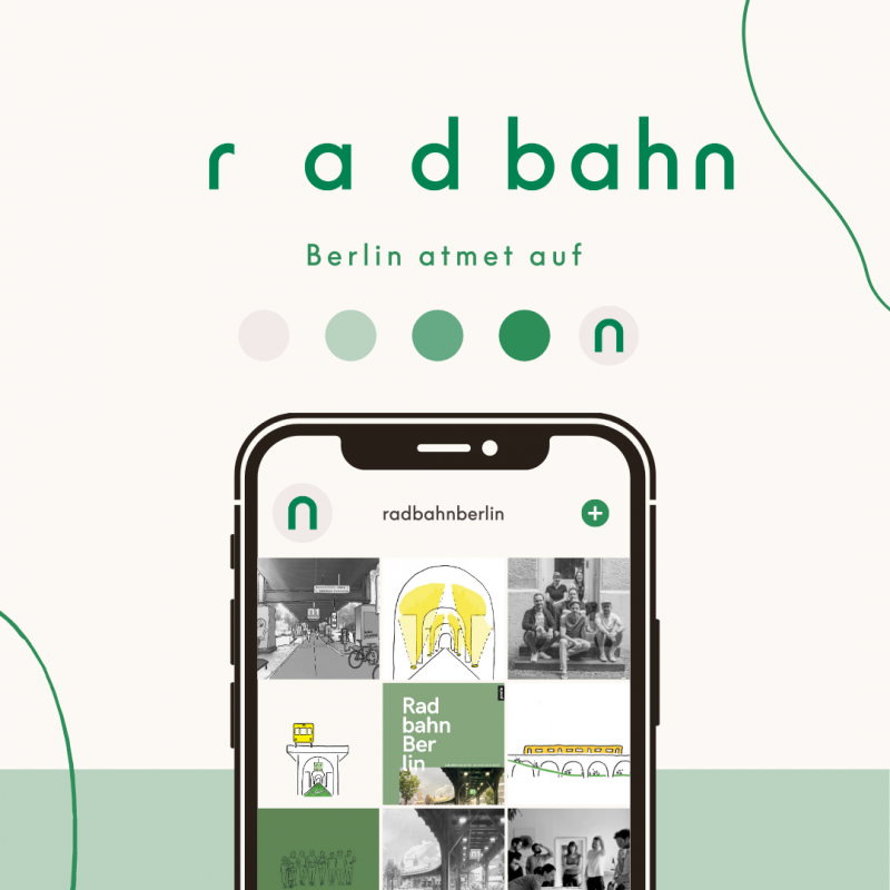
A reduced typeface and further development of the U-Bahn arch as a symbol playfully embraces the open space, creating a place of deceleration, both visually and symbolically. This evolution of the logo still contains the spirit of the original but uses a new color palette - inspired by the trajc green - and builds bridges between the mobile and the ecological as well as the technical and the human.
We hope you like it and would like to thank our partner agency WAALD for the strategic and creative support.